Choropleth Mapping
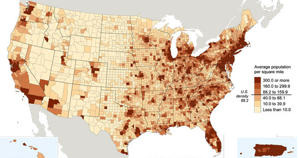
- Choropleth map is one that uses different colours or densities of shading to show the distribution of data categories or spread of data over an area. Each spatial unit is filled with one uniform colour or pattern, appropriate for the data that have been scaled in some way.
- Choropleth maps are appropriate for showing distribution of population density, car ownership, land use pattern, type of forest cover and so on.
- Choropleth maps are useful for comparison and pattern identification in the distribution
Drawing a choropleth map
Choropleth map uses different colours or density of shading
Calculate range, determine class interval and divide values into equal size classes in case of close ended class index.
If the data values are too much unequal in its distribution and show very high range, then open ended class (with more than or less than at any end of the class index) can be devised.
None of the class category values should overlap
Areas are shaded according to a prearranged colour shading key.
Each shading or colour represents particular range of values.
The colours become darker as the values increase.
Steps involved in drawing of choropleth maps
Obtain a base map with boundaries or any areal units for which data are available 2. Calculate the range of data 3. Devise a shading scale. 4. Divide your data into groups of equal size classes